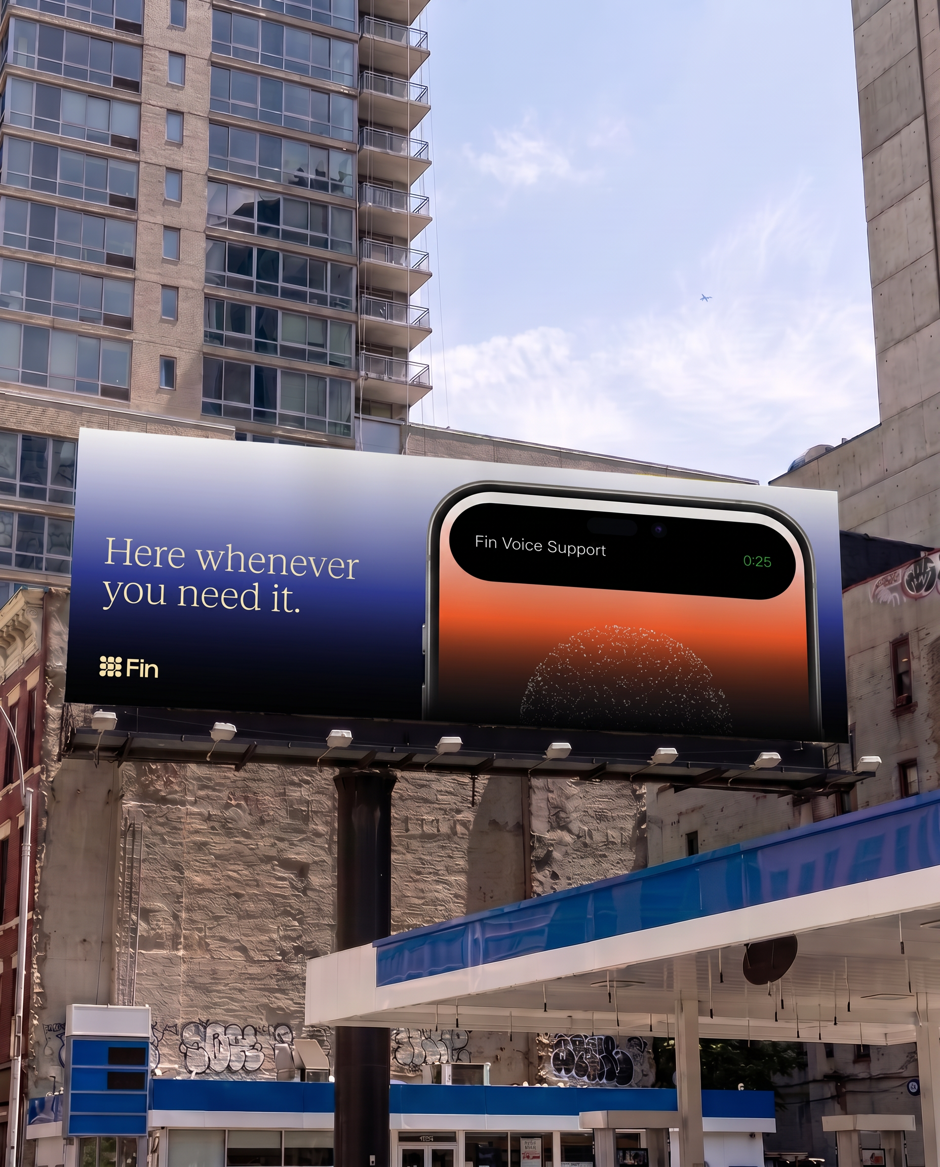
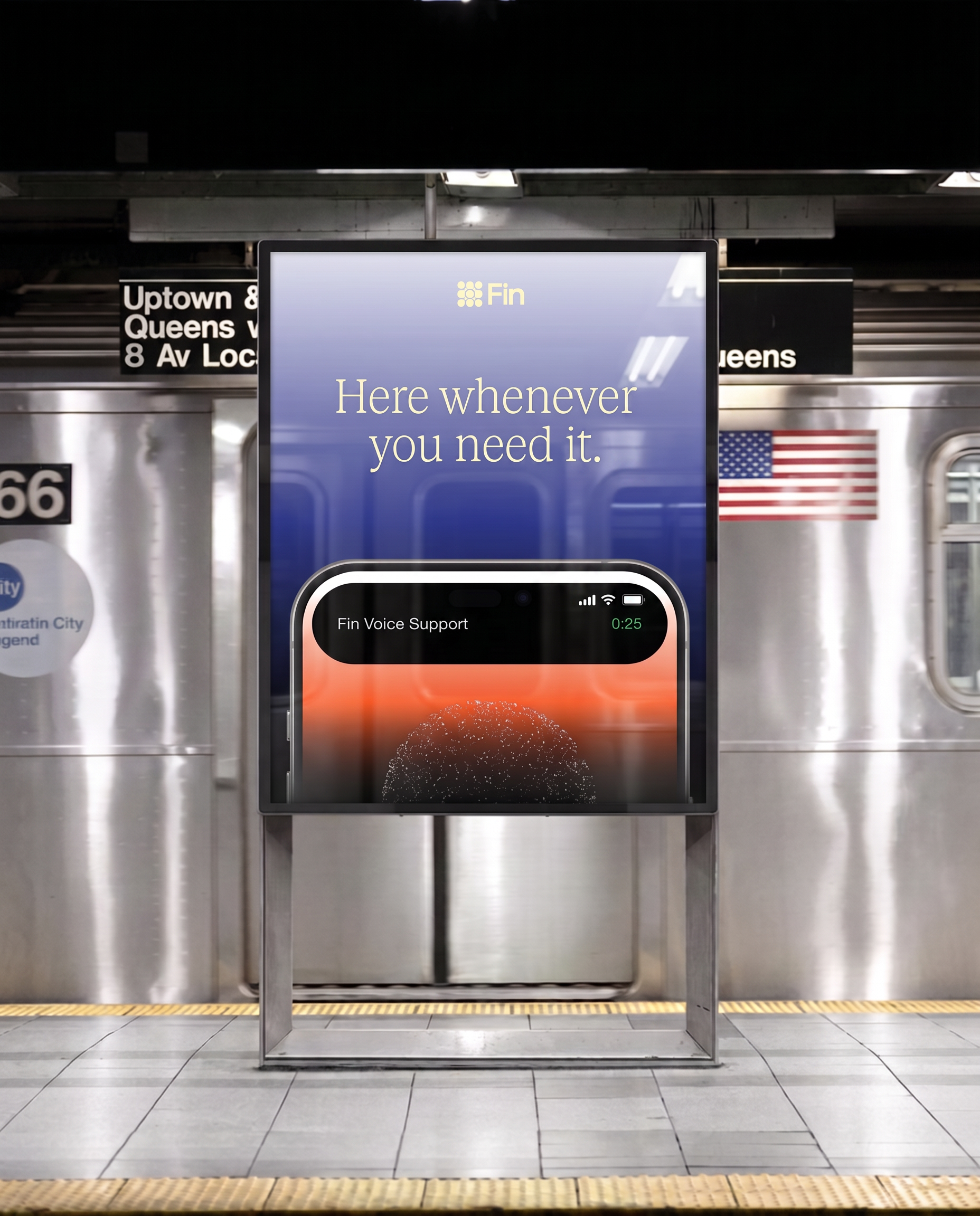
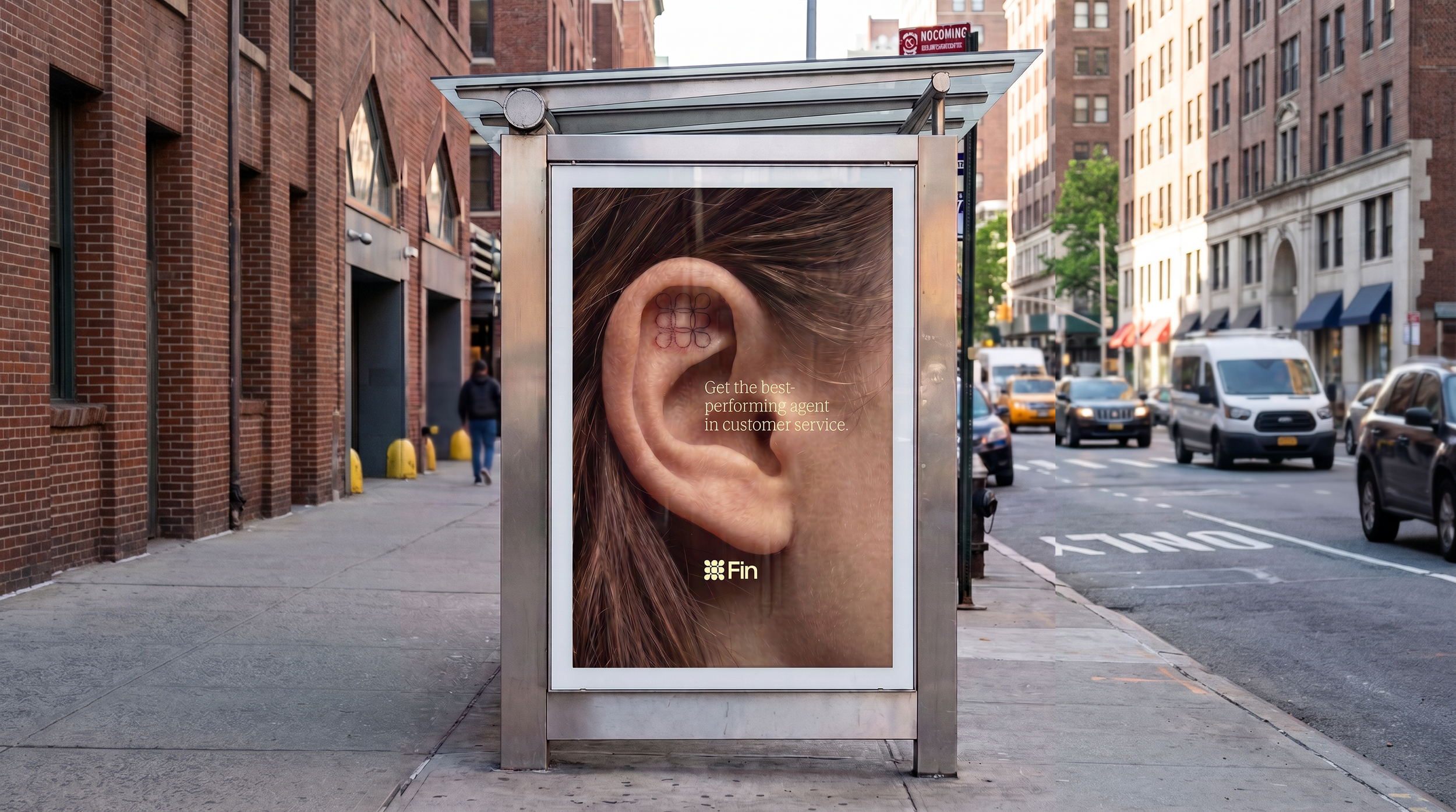
For our Fin.ai spec campaign, we set out to fix a gap in the brand's original advertising:
a customer service AI company whose messaging didn't feel like it understood people.
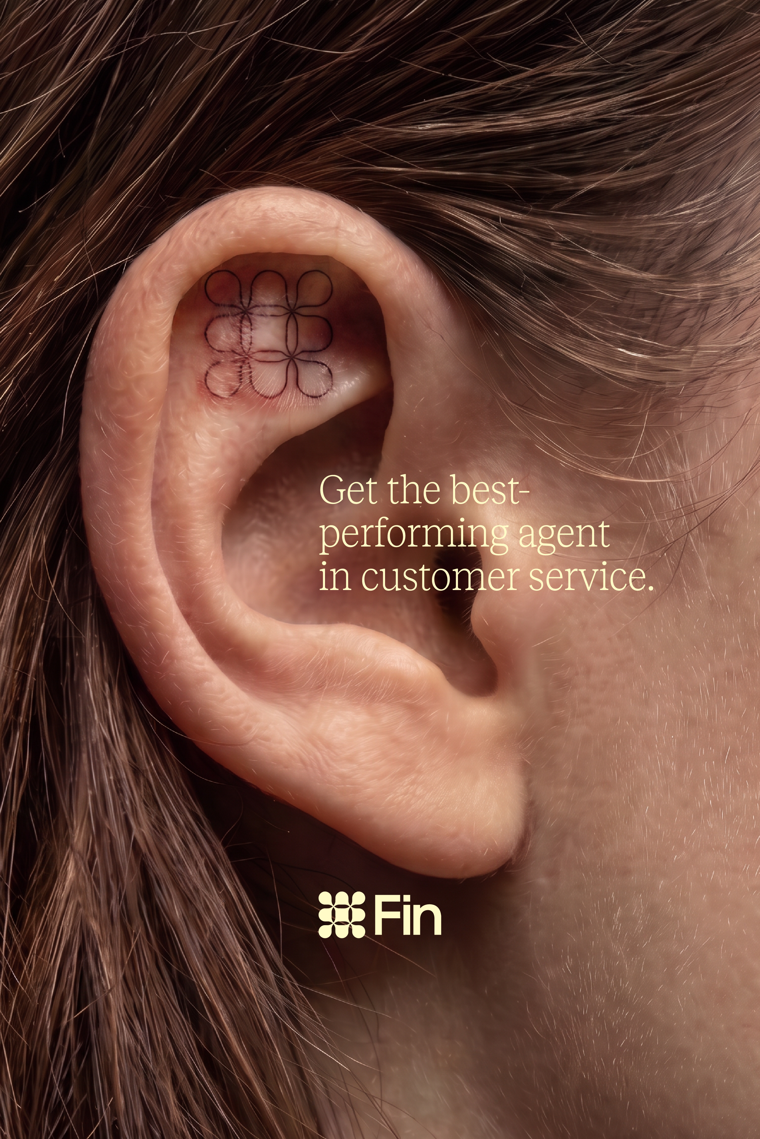
One direction takes the brand's dot-matrix mark and reimagines it as a tattoo behind the ear, playing on the idea that Fin isn't just answering tickets; it's genuinely listening in a more playful, human way in a category that usually leans sterile.
[FIN.AI]
2026
Landing Page
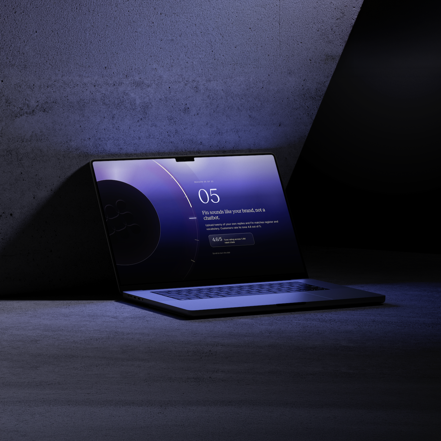
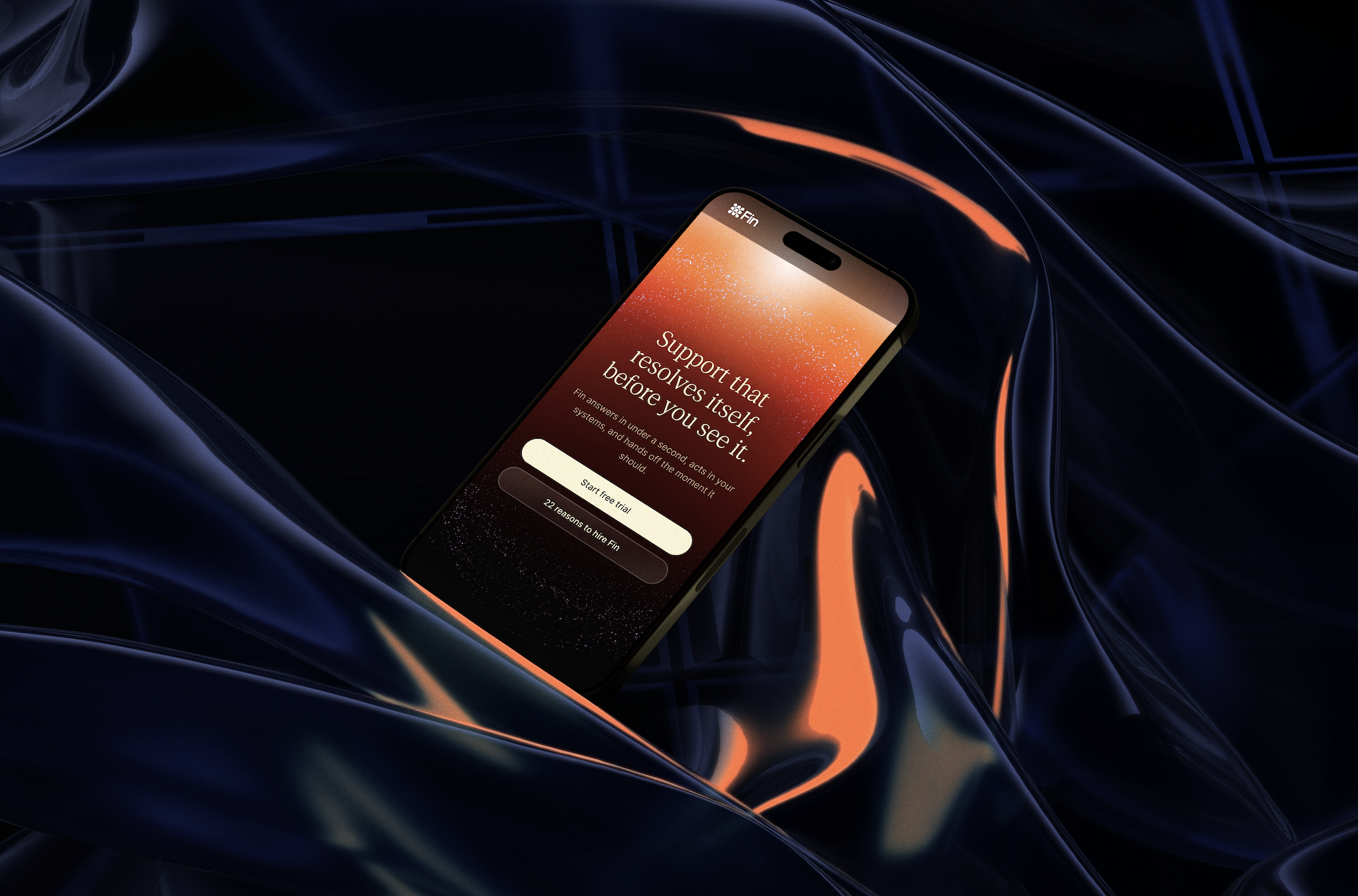
Interface work, shown in full. Pricing that responds to your cursor, a dial you turn by scrolling, a particle field that waits until you reach for it.
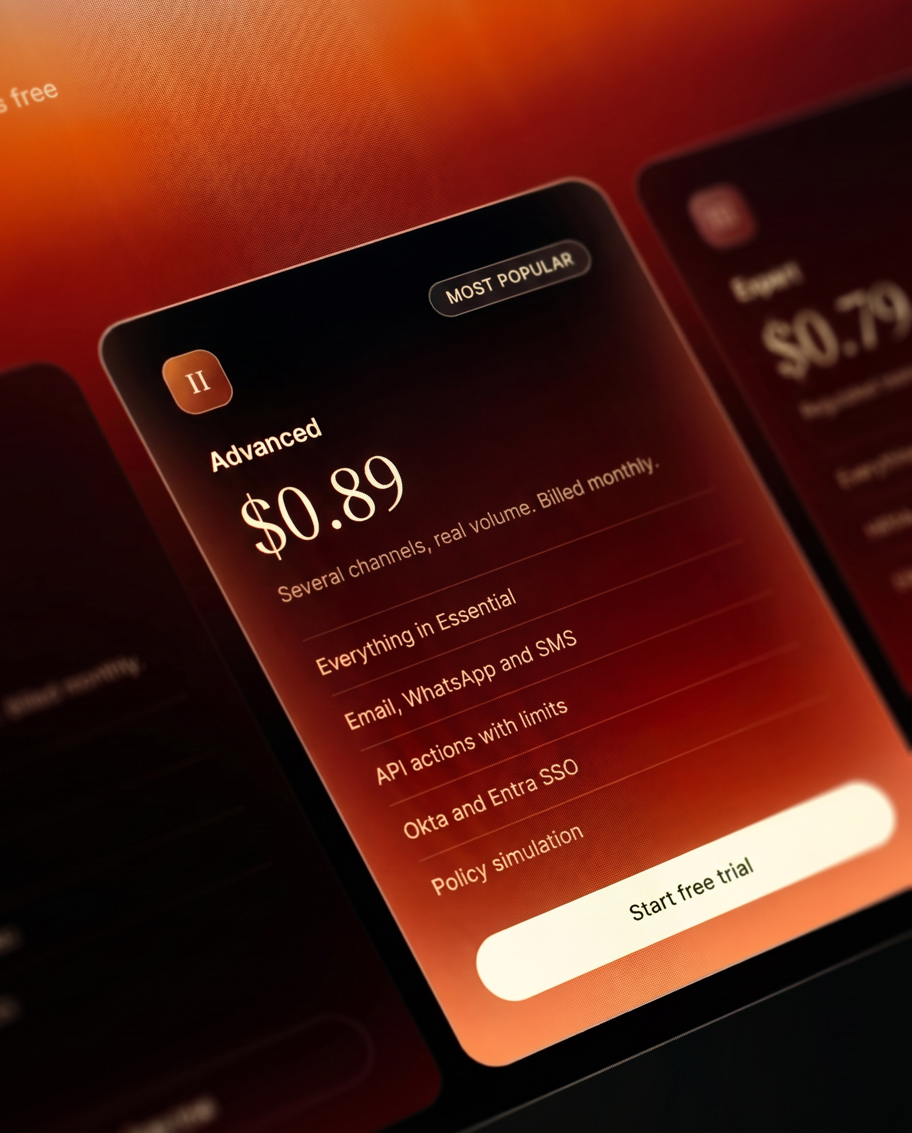
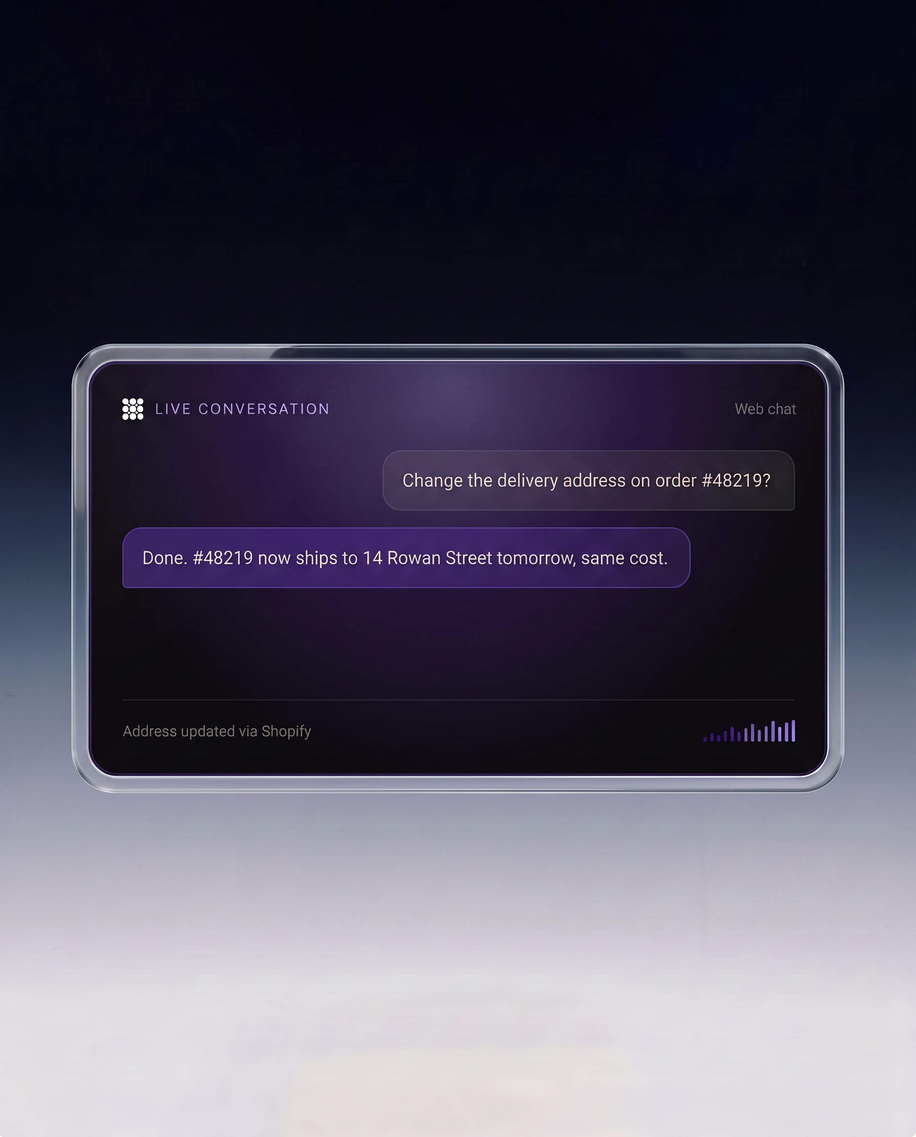
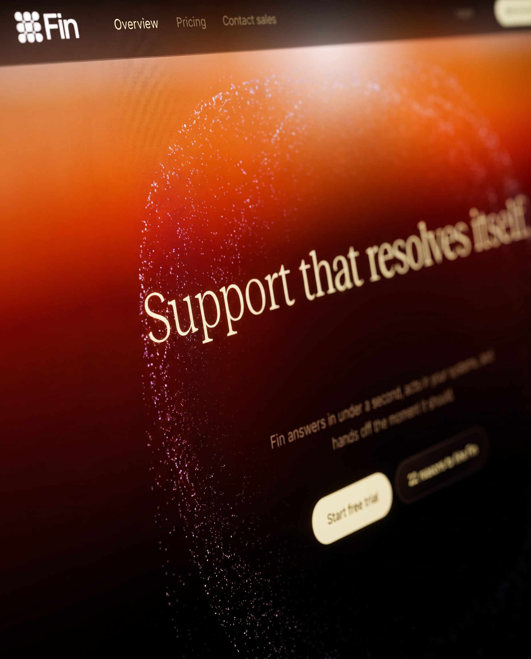
Branding, campaign, and social.
We built Fin a visual system simple enough to survive every format it lands in: a poster, a paid social frame, a film still, a square in someone's feed.
Social Assets
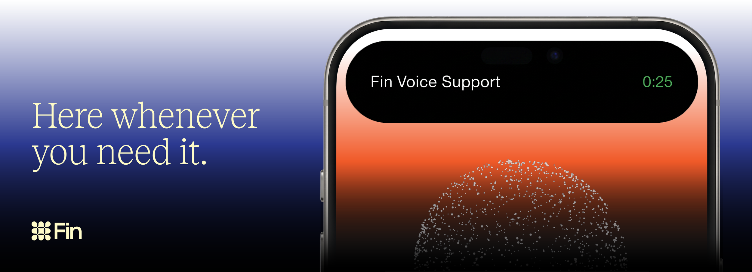
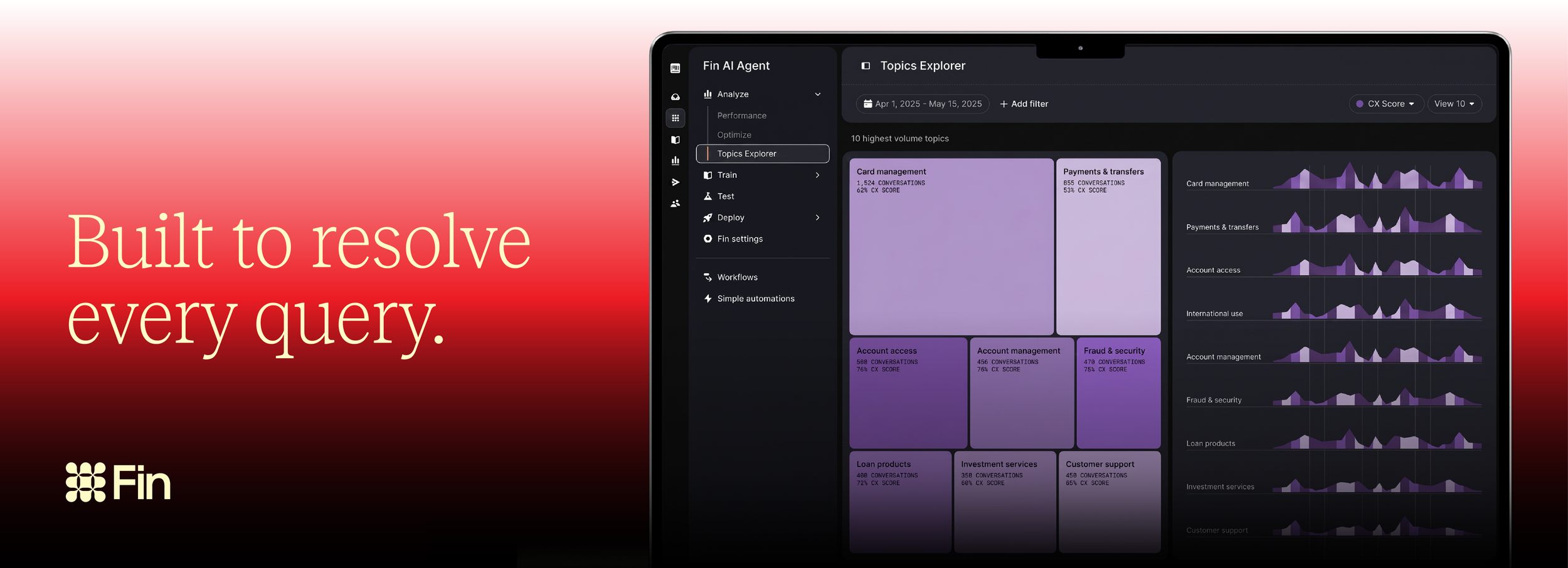
The other leans into warm, shifting gradients as a metaphor for accessibility itself:
no hard edges, no fixed hours, just a constant presence that adapts to whenever and wherever the user needs it, making an AI support product feel less like software and more like something dependable sitting quietly in the background of your day.