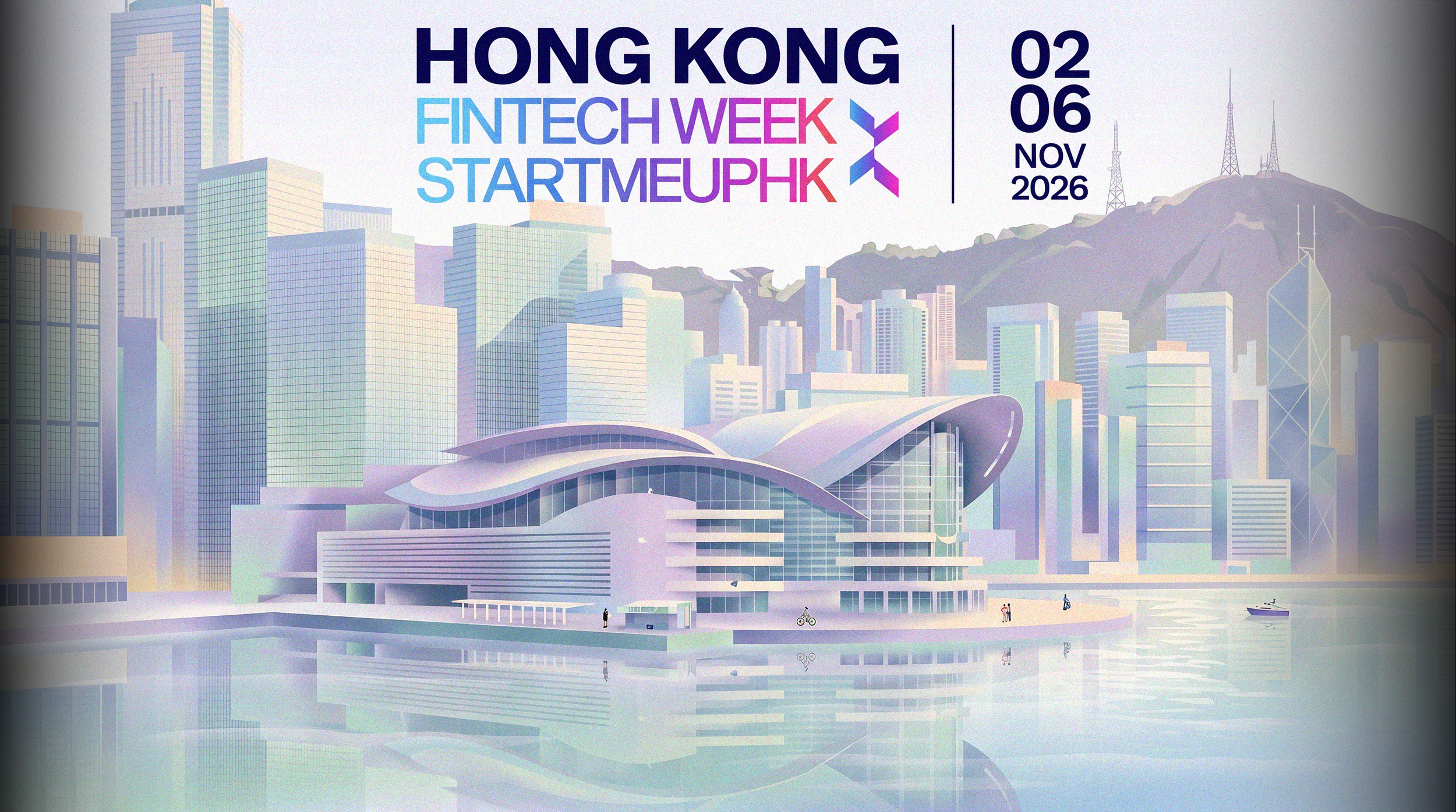
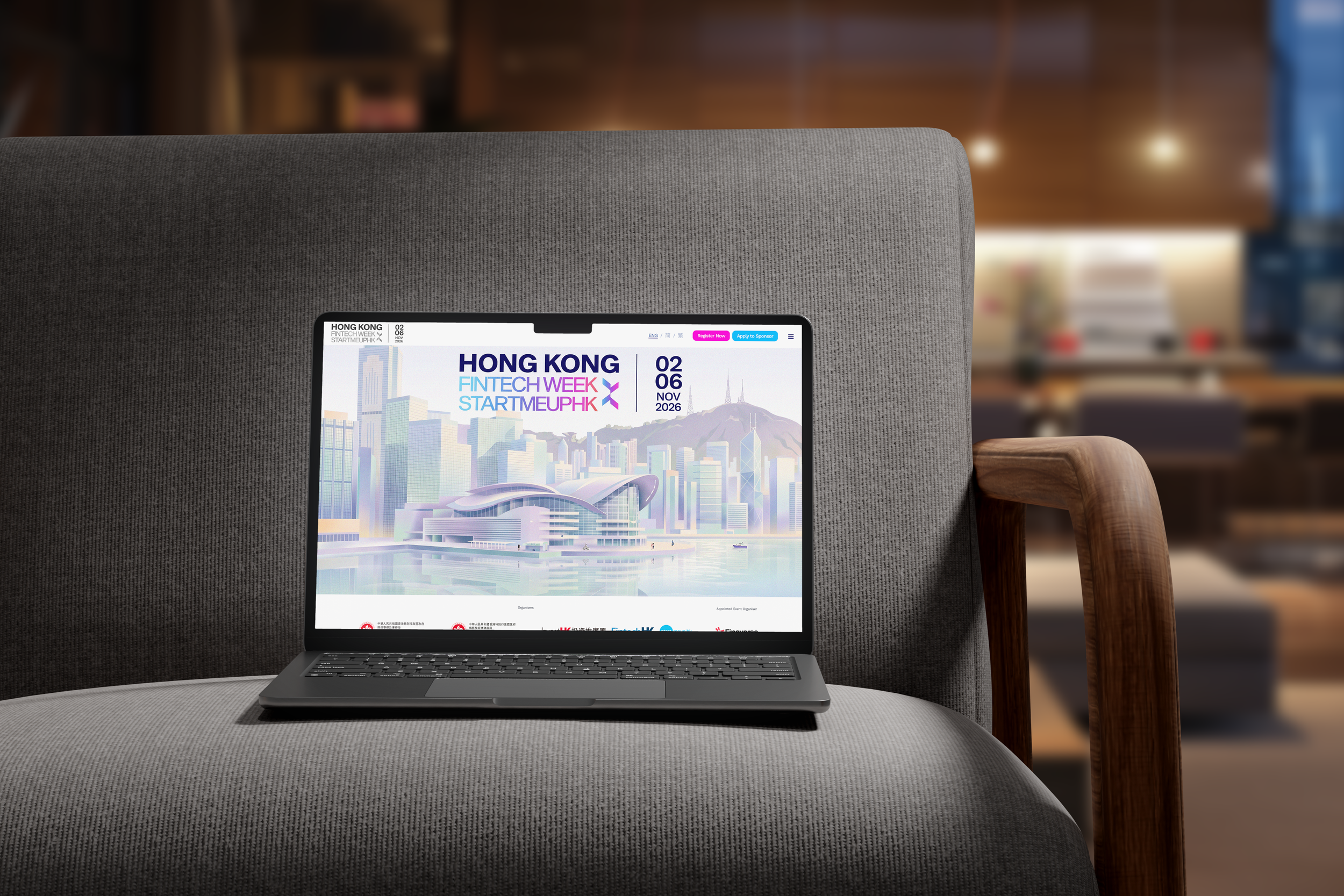
For our Hong Kong FinTech Week rebrand, we moved away from the flat, high-saturation gradient system used in the official campaign and built a softer, more dimensional palette rooted in pearlescent purples, seafoam, and warm neutrals.
The geometric diamond motif stays intact as a nod to the event's original visual language, but we rebuilt the color logic to read more like brushed metal or shifting light on glass than a digital gradient tool default.
[Hong Kong FinTech Week 2026]
2026
Poster one : violet
Hong Kong FinTech Week × StartmeupHK
Key visual, poster series
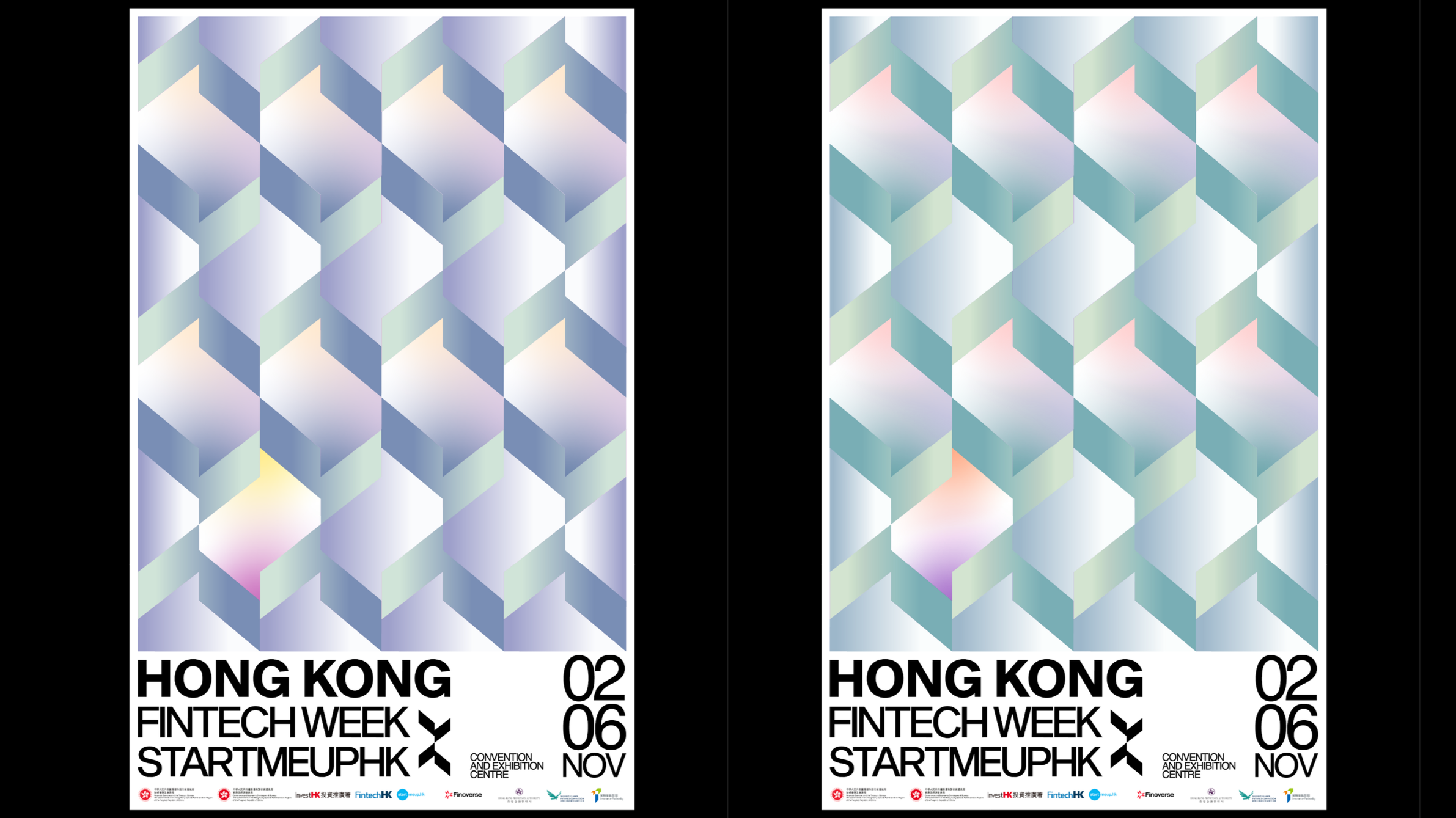
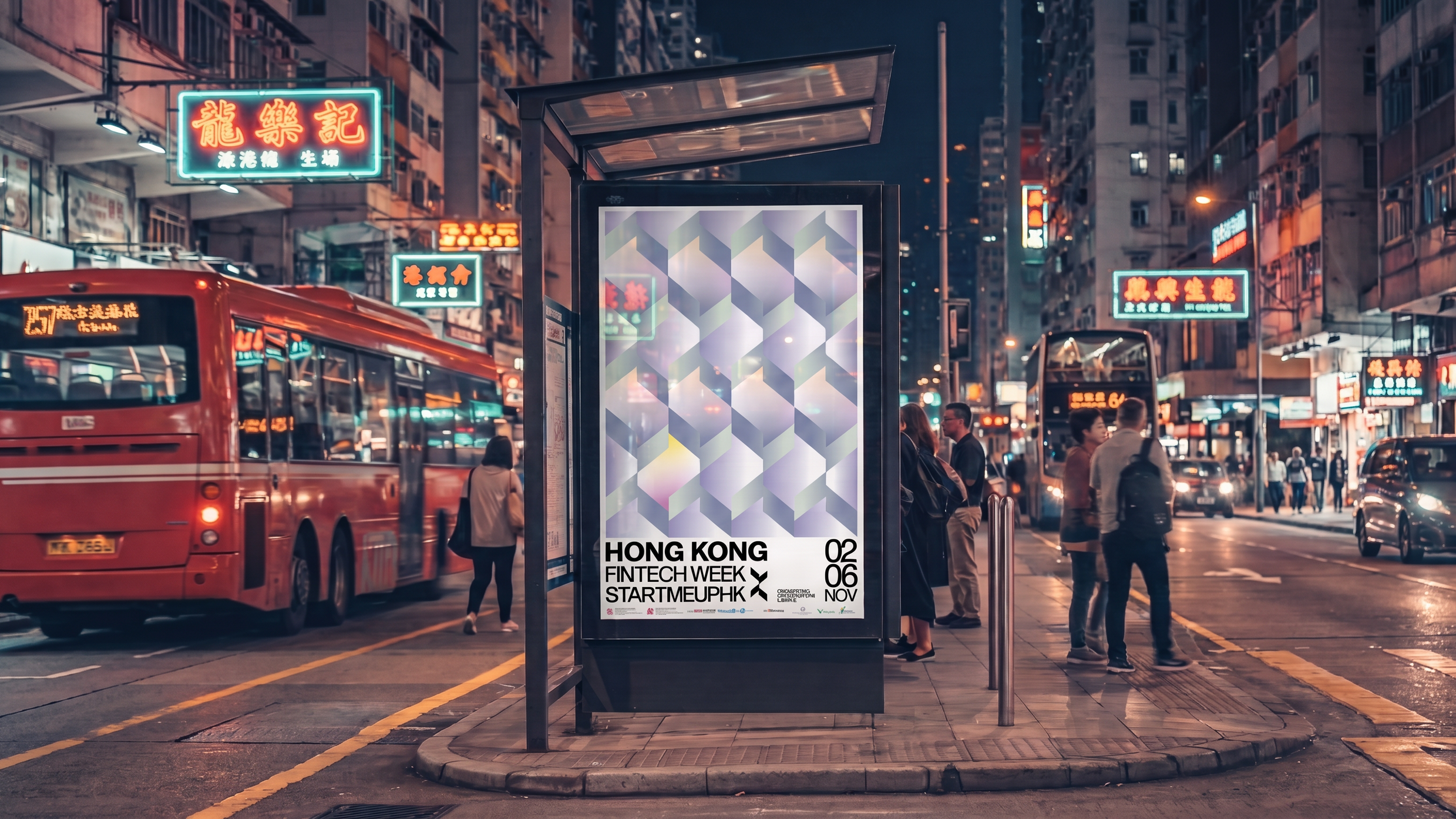
We built the key visual around a monogram drawn from the FinTech Week logo. The chevron at the heart of the mark became the unit for everything above it: repeated on an isometric grid, it reads as a field of stacked volumes that never quite resolves into flat pattern or solid form. Iridescent gradients run across the faces so the surface shifts as the eye moves, with violet and lilac carrying this variant and a single warm cell breaking the run. Below it, the type block stays flat and mechanical: bold caps, the date set large at the right, sponsor lockup along the base, so the image gets to be the only thing doing the moving.
Poster two : mint
Second colorway
The same grid, the same monogram, retuned to mint and green. Running the system in a second palette was the test of whether it held: the pattern geometry never changes, only the gradients mapped onto it, and the warm cell lands in a different position so the two posters read as a pair rather than a duplicate. Both were built to sit together on a wall and to work independently across digital placements.
Two things worth confirming: I've described the monogram as chevron-derived based on the mark next to STARTMEUPHK, so correct me if it's built differently. And if the two posters had assigned roles (one primary, one for a specific channel), that's worth naming instead of "second colorway."