We built the visual identity for NYSFA, a New York school teaching fashion and art side by side.
The mark stacks NY over SFA and lets the letterforms interlock, with the F held in gray so the two halves read as one unit rather than an acronym spelled out. Around it we built a navy and gold system: a fine wavy line pattern that fills space without competing with type, and a palette borrowed from academic regalia. The engagement covered the logo and brand system, the main poster graphic, the course catalog, and a set of program pamphlets. A selection is shown here; student-facing and internal materials are withheld at the school's request.
[New York School of Fashion and Art]
2022
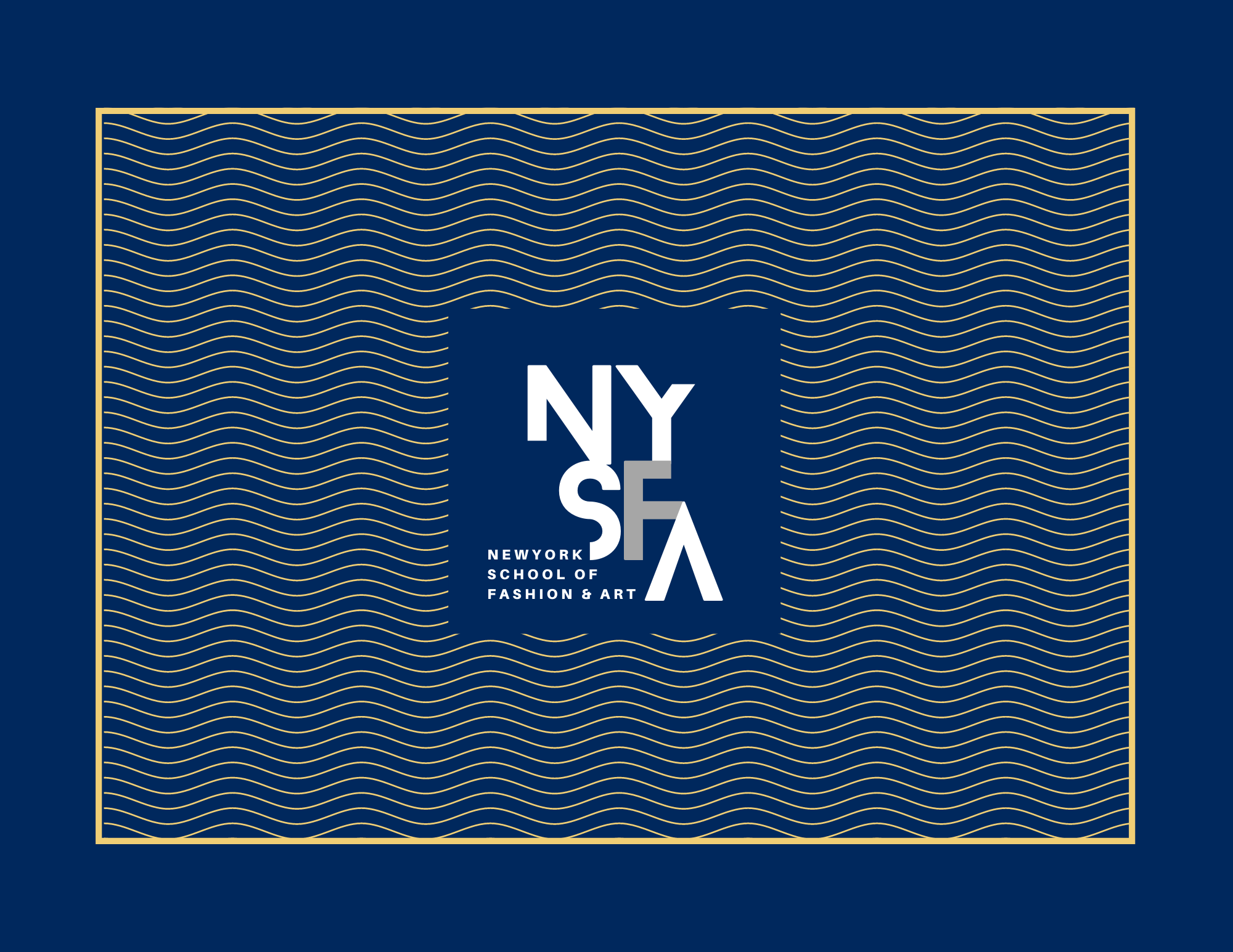
We gave the mark room to sit alone. A gold rule frames the composition and the wave pattern runs edge to edge behind it, interrupted only where the logo needs clearance, so the negative space around the mark is carved out of the pattern rather than laid on top of it. Navy carries the field, gold carries the line work, and nothing else enters the frame. We built it to hold at large format and to crop down without losing the mark.

The catalog turns the identity into a working document. We carried the wave pattern and gold rule onto covers and dividers, then stepped them back so program listings and admissions information stay legible across long stretches of text. One grid runs through the whole book so readers move between sections without relearning the layout, and the navy and gold pairing keeps it recognizable next to the poster and pamphlets. We're showing the cover and select spreads only, since the full catalog contains enrollment details that stay private.